Introduction
Creating a beautiful home isn’t just about buying expensive furniture or following trends—it’s about achieving harmony. One of the most powerful ways to do that is by using balanced color tones in home decor. Colors influence mood, perception, and even how spacious or cozy a room feels.
If your home feels “off” but you can’t quite figure out why, chances are the color balance needs adjustment.

In this comprehensive guide, you’ll learn how to use color tones effectively, avoid common mistakes, and design a space that feels both stylish and comfortable.
Why Color Balance Matters in Home Decor
Color is more than decoration—it’s an emotional tool. When used correctly, it can:
- Make small rooms feel bigger
- Create warmth or calmness
- Highlight architectural features
- Improve overall visual flow
Unbalanced colors, on the other hand, can make a space feel chaotic, dull, or overwhelming.
Balanced color tones help you:
- Maintain visual harmony
- Avoid clashing shades
- Create a cohesive design throughout your home
Understanding Color Theory Basics
Before decorating, you need a basic understanding of color theory.
Primary Colors
- Red
- Blue
- Yellow
Secondary Colors
- Green
- Orange
- Purple
Tertiary Colors
These are combinations of primary and secondary colors.
Warm vs Cool Colors
Warm colors:
- Red, orange, yellow
- Energetic and cozy
Cool colors:
- Blue, green, purple
- Calm and relaxing
Balancing warm and cool tones is essential for creating a comfortable environment.
What Are Balanced Color Tones?
Balanced color tones mean distributing colors in a way that feels visually pleasing and not overwhelming.
A well-balanced room typically includes:
- A dominant color (main tone)
- A secondary color (supporting tone)
- Accent colors (highlights)
This balance ensures that no single color dominates too aggressively.
The 60-30-10 Rule (Golden Rule of Color Balance)
Interior designers often use the 60-30-10 rule.
How it works:
- 60% – Dominant Color
Walls, large furniture - 30% – Secondary Color
Curtains, chairs, bedding - 10% – Accent Color
Cushions, decor items, art
This simple rule helps you create a structured and harmonious look without overthinking.
Choosing the Right Base Color
Your base color sets the tone for the entire room.
Neutral Base Colors (Best for Balance)
- White
- Beige
- Grey
- Soft cream
Neutral tones work well because they:
- Pair easily with other colors
- Create a clean backdrop
- Prevent visual overload
If you’re unsure, always start with a neutral base.
How to Combine Colors Effectively
Monochromatic Scheme
Use different shades of the same color.
Example:
- Light blue walls
- Navy sofa
- Sky blue cushions
This creates a calm and elegant look.
Analogous Color Scheme
Use colors next to each other on the color wheel.
Example:
- Blue, green, teal
This creates a natural and soothing feel.
Complementary Colors
Use opposite colors on the color wheel.
Example:
- Blue and orange
- Yellow and purple
This creates contrast and energy—but must be balanced carefully.
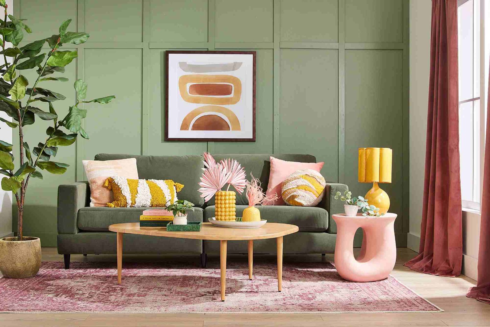
Neutral + Pop of Color
This is one of the safest and most popular choices.
Example:
- Grey room + mustard yellow accents
It adds personality without overwhelming the space.
Room-by-Room Color Balance Guide
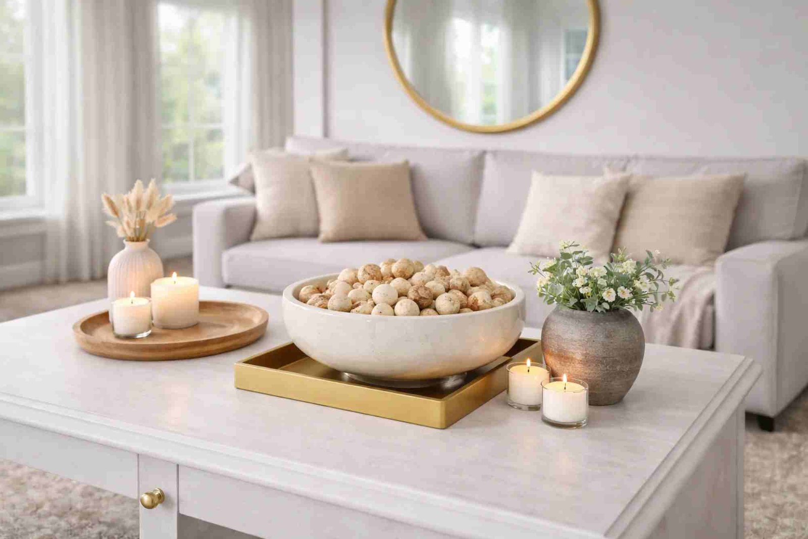
Living Room
The living room is the heart of your home.
Best approach:
- Neutral base (grey, beige)
- Warm accents (orange, mustard, gold)
Tips:
- Use cushions and rugs to introduce color
- Avoid too many bright colors
- Keep balance between furniture and walls
Bedroom
The bedroom should feel relaxing.
Best colors:
- Soft blues
- Pastel greens
- Light neutrals
Avoid:
- Too much red or neon colors
Balance tip:
Use darker tones in small amounts (like pillows or headboards).
Kitchen
Kitchens can handle more energy.
Popular combinations:
- White + wood tones
- Black + gold accents
- Grey + pastel colors
Balance tip:
Keep cabinets neutral and add color through accessories.
Bathroom
Bathrooms should feel clean and refreshing.
Best colors:
- White
- Light blue
- Soft grey
Balance tip:
Add contrast with dark fixtures or tiles.
Using Textures to Enhance Color Balance
Color isn’t just about paint—it’s also about texture.
Combine:
- Wood
- Metal
- Fabric
- Glass
Example:
A neutral room becomes more dynamic with:
- Wooden tables
- Velvet cushions
- Metal lamps
Textures add depth without adding new colors.
Lighting and Its Impact on Color
Lighting can completely change how colors look.
Natural Light
- Makes colors appear brighter
- Best for true color visibility
Artificial Light
- Warm light enhances warm tones
- Cool light enhances cool tones
Tip:
Always test paint colors under your room’s lighting.
Common Color Mistakes to Avoid
Using Too Many Colors
Too many colors create confusion.
Stick to 2–4 main colors.
Ignoring Undertones
Colors have hidden undertones (warm or cool).
Mixing warm grey with cool blue can feel off.
Overusing Bold Colors
Bright colors are best used as accents.
Matching Everything Exactly
Perfect matching looks unnatural.
Use variations instead.
Forgetting Flow Between Rooms
Each room should connect visually.
Use a consistent color palette throughout your home.
Seasonal Color Adjustments
You can refresh your home without repainting.
Summer
- Light fabrics
- Bright accents
Winter
- Warm tones
- Darker textures
Spring
- Pastels
- Floral elements
Autumn
- Earth tones
- Deep oranges and browns
How to Add Accent Colors Smartly
Accent colors bring life to your design.
Use them in:
- Cushions
- Rugs
- Curtains
- Wall art
Tip:
Repeat the same accent color in 2–3 places for consistency.
Minimalist vs Bold Color Styles
Minimalist Style
- Neutral tones
- Simple palette
- Calm atmosphere
Bold Style
- Strong contrasts
- Bright accents
- Statement pieces
Both can be balanced—it depends on your preference.
Budget-Friendly Color Decorating Tips
You don’t need a big budget to achieve balance.
Affordable ideas:
- Change cushion covers
- Add wall art
- Use plants
- Rearrange furniture
- Paint one accent wall
Small changes can make a big difference.
Psychological Effects of Colors
Colors affect mood more than you think.
- Blue → calmness
- Green → freshness
- Yellow → happiness
- Red → energy
- Grey → sophistication
Choose colors based on how you want to feel in a space.
Creating a Cohesive Home Color Palette
To keep your entire home consistent:
- Choose a base palette
- Use variations in each room
- Repeat key colors
- Maintain flow between spaces
This creates a professional, designer-like look.
Expert Tips for Perfect Color Balance
- Always test colors before finalizing
- Use neutral backgrounds for flexibility
- Add contrast gradually
- Keep visual weight balanced
- Trust your instincts but follow basic rules
Decorating your home with balanced color tones is both an art and a science. When done right, it transforms your living space into a place that feels comfortable, stylish, and truly yours.
You don’t need to be an interior designer to achieve this. By understanding basic color principles, applying simple rules like 60-30-10, and avoiding common mistakes, you can create a beautifully balanced home.
Start small, experiment with confidence, and refine your choices over time. The goal is not perfection—but harmony.
Bonus: Quick Color Balance Checklist
- Choose 2–4 main colors
- Follow the 60-30-10 rule
- Balance warm and cool tones
- Use neutral base colors
- Add accents carefully
- Maintain consistency across rooms
- Test colors in lighting
- Avoid over-decorating
If you want, I can also:
- convert this into HTML format
- add internal linking structure
- create Pinterest titles + SEO keywords
- generate featured image prompts